
VOL. 26 MOTION DESIGN ED.
VOL. 26 MOTION DESIGNER EDITION
LIVING SINCE 1996 ★★★★★
LIVING SINCE 1996 ★★★★★
AMERICAN HORROR STORY
URBAN LEAGUE OF GREATER KC
URBAN LEAGUE OF GREATER KC
URBAN LEAGUE OF
GREATER KC
URBAN LEAGUE OF GREATER KC
DELICATE :
THE TWELFTH SEASON
Design & Editorial By HALEY HENNIER
Lead Editor & Designer NAHARA PACHECO
Creative Direction By JEROME CHENG
A CENTURY OF PROGRESS
Motion Design By HALEY HENNIER
Design By ZAC GREASON & ALYSON JACK
Written By JIM HOWARD
A CENTURY OF PROGRESS
Motion Design By HALEY HENNIER
Design By ZAC GREASON & ALYSON JACK
Written By JIM HOWARD
A CENTURY OF PROGRESS
Motion Design By HALEY HENNIER
Design By ZAC GREASON & ALYSON JACK
Written By JIM HOWARD
A CENTURY OF PROGRESS
Motion Design By HALEY HENNIER
Design By ZAC GREASON & ALYSON JACK
Written By JIM HOWARD
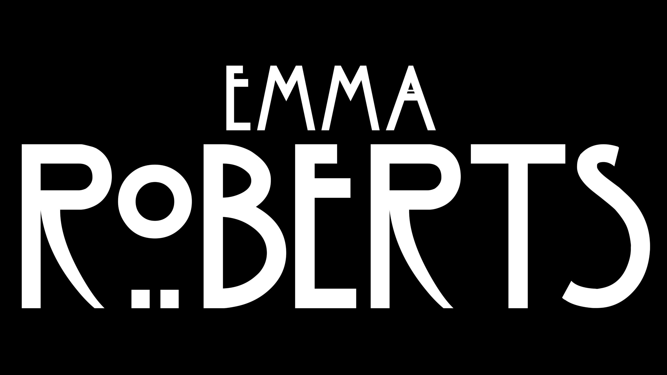
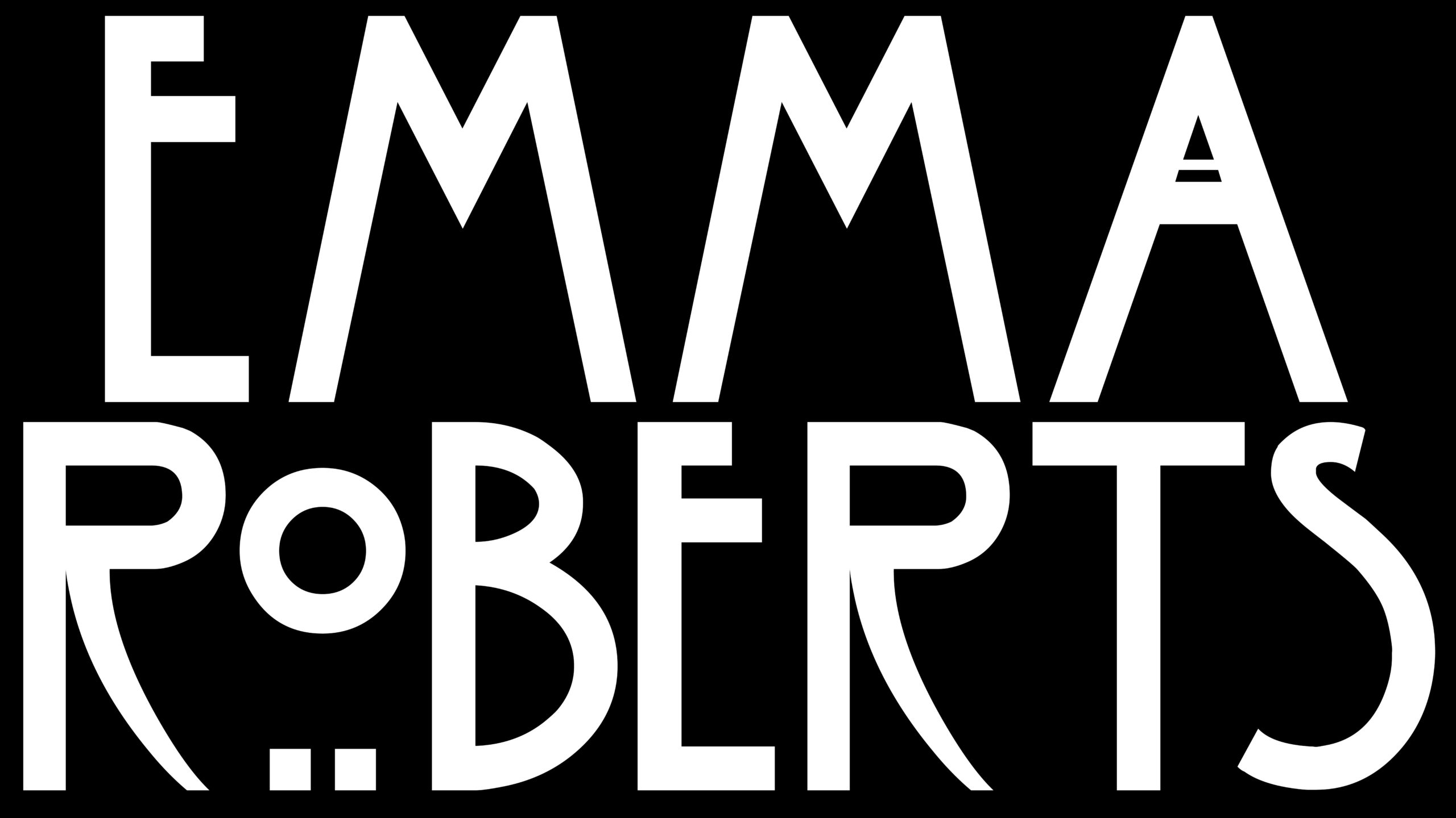
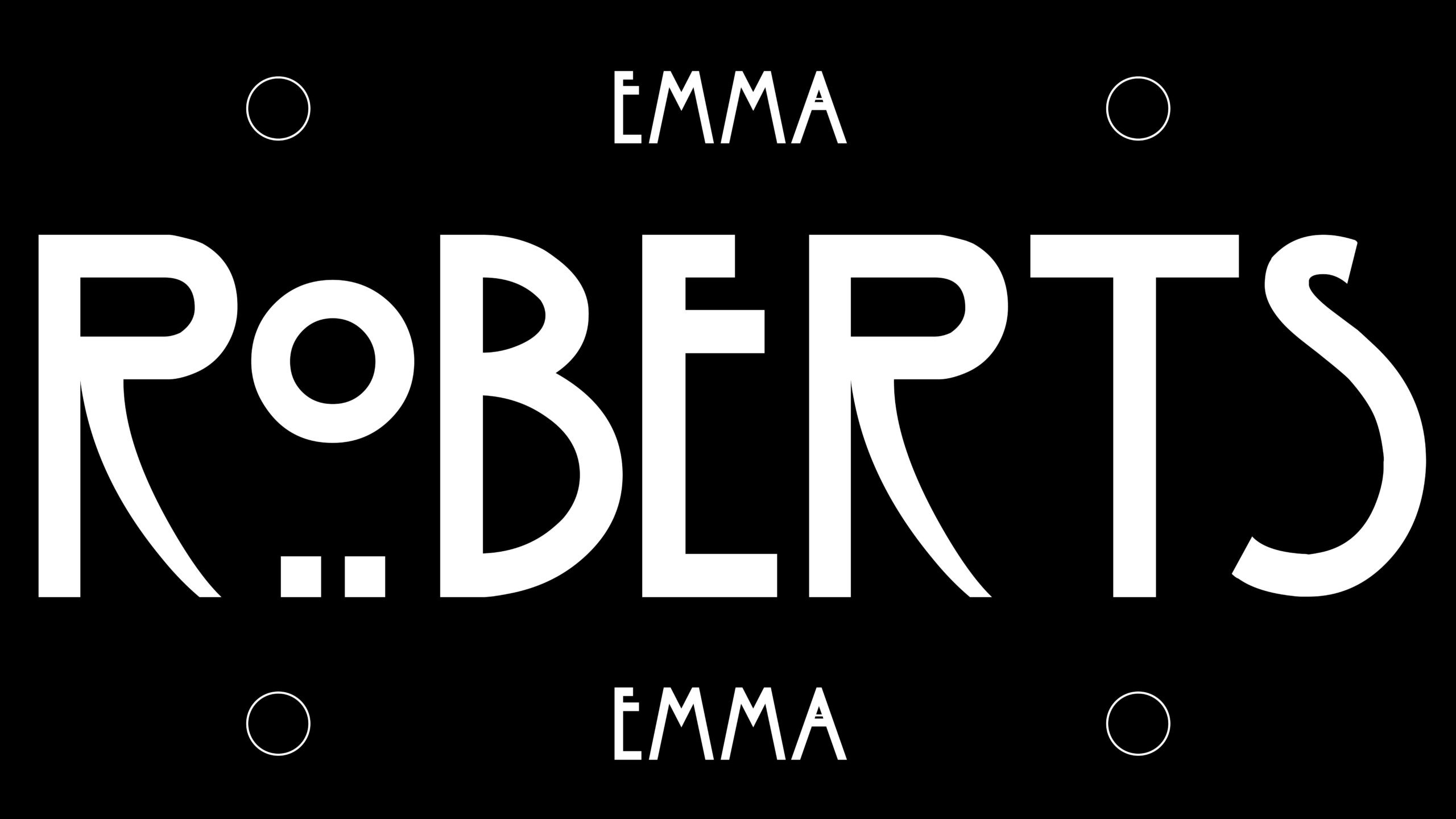
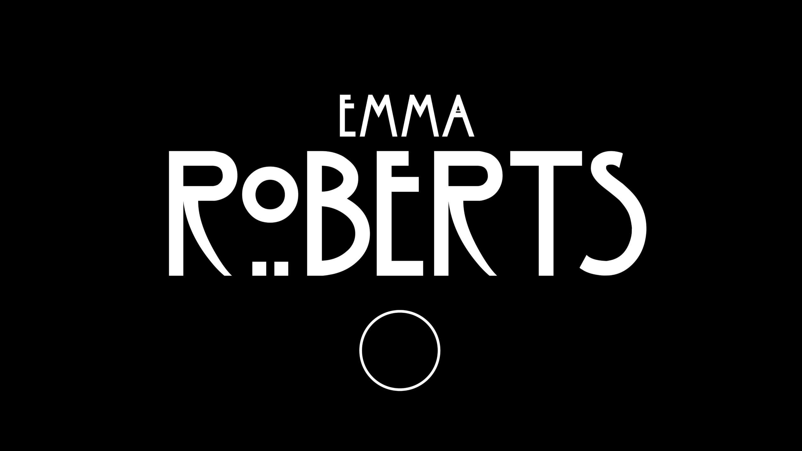
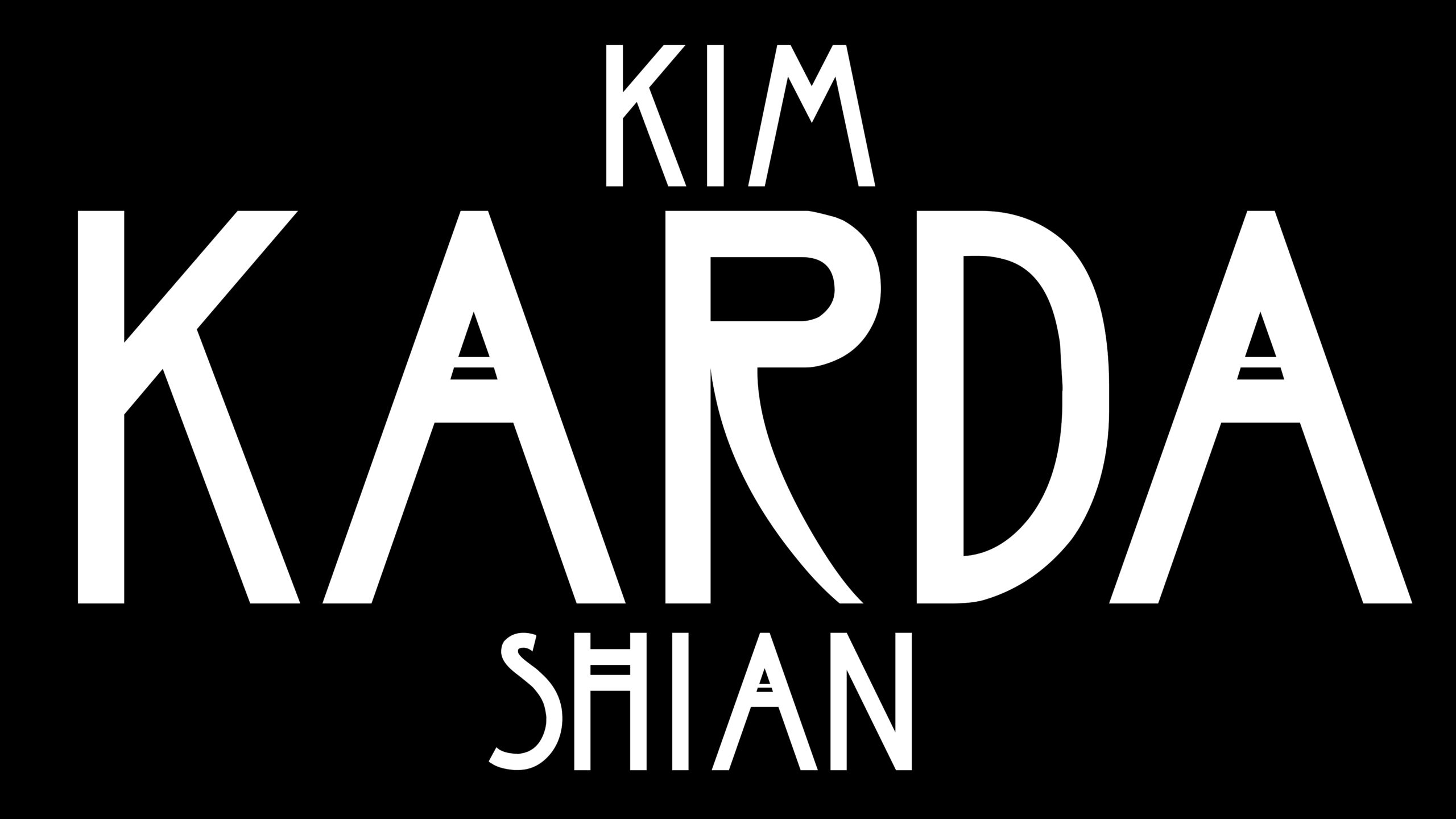
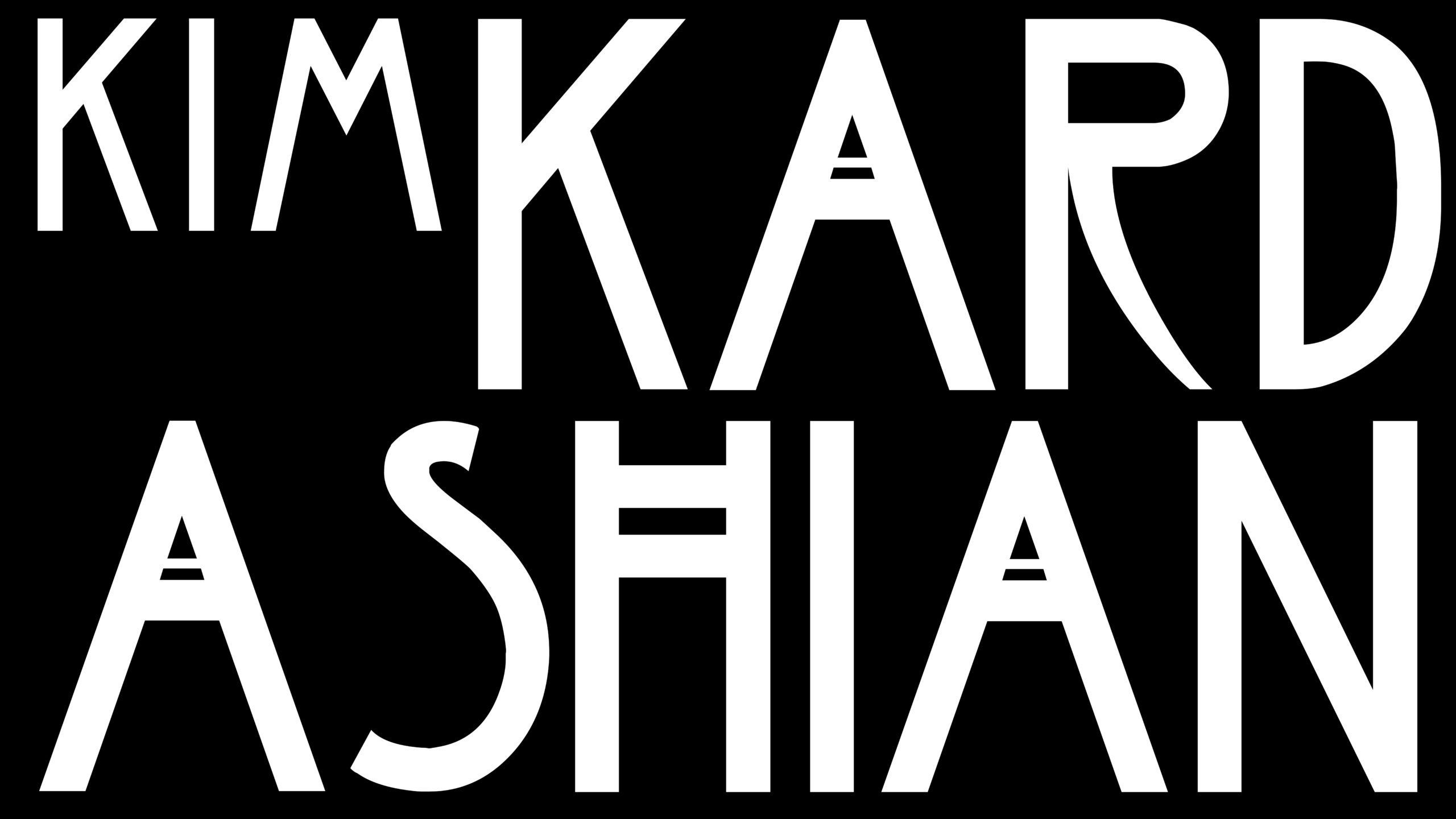
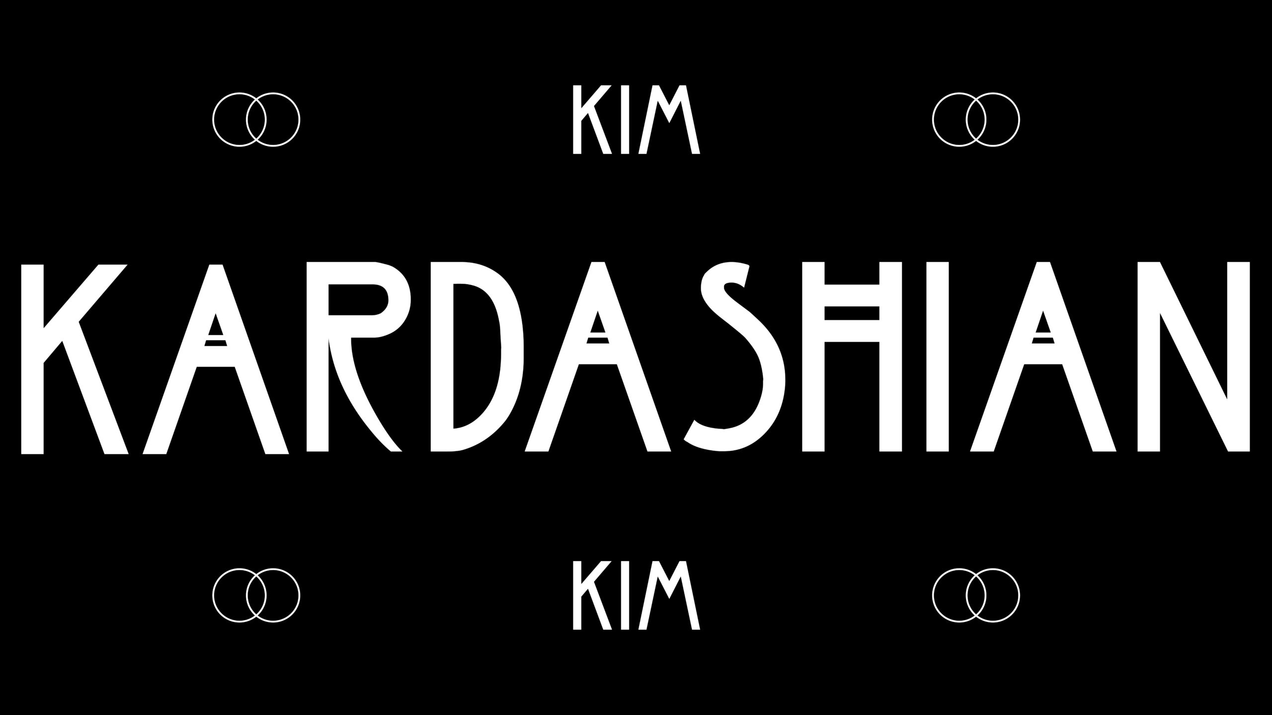
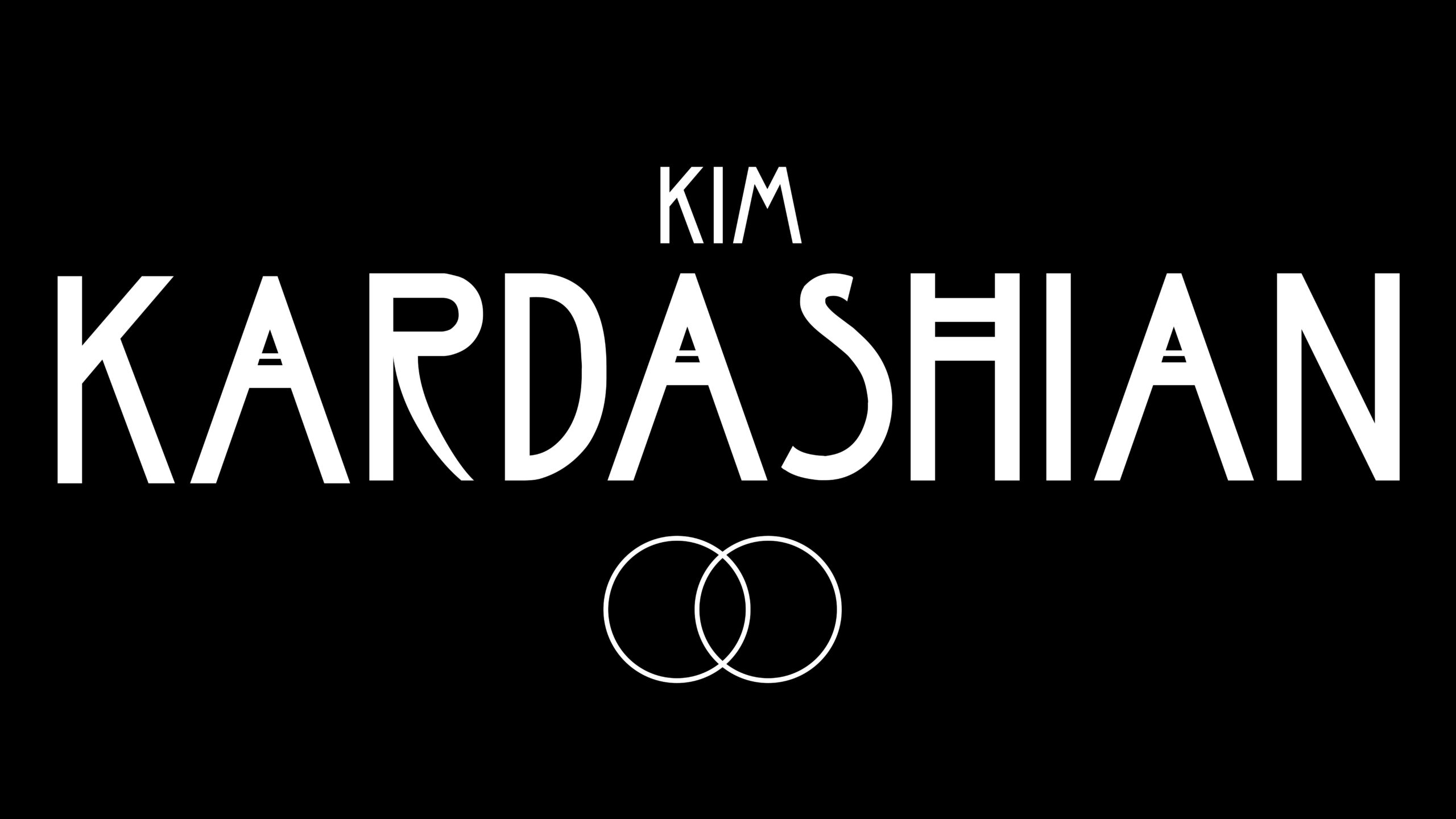
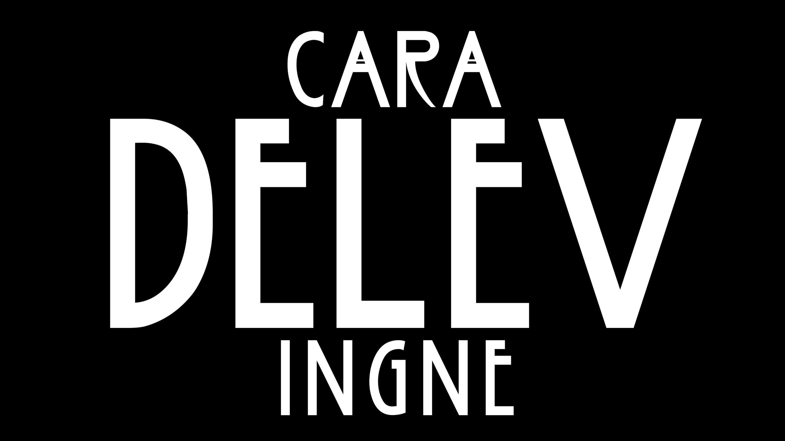
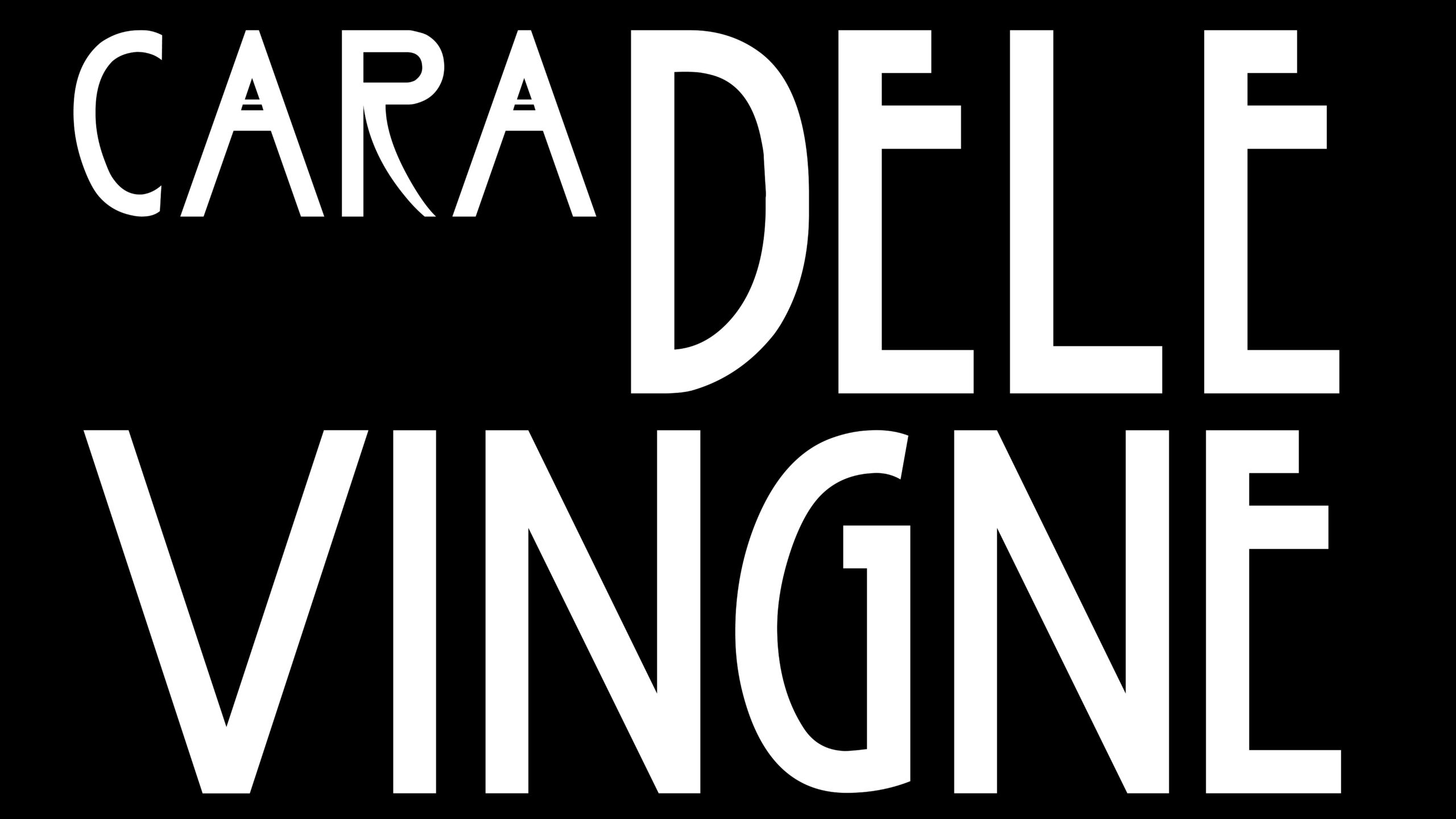
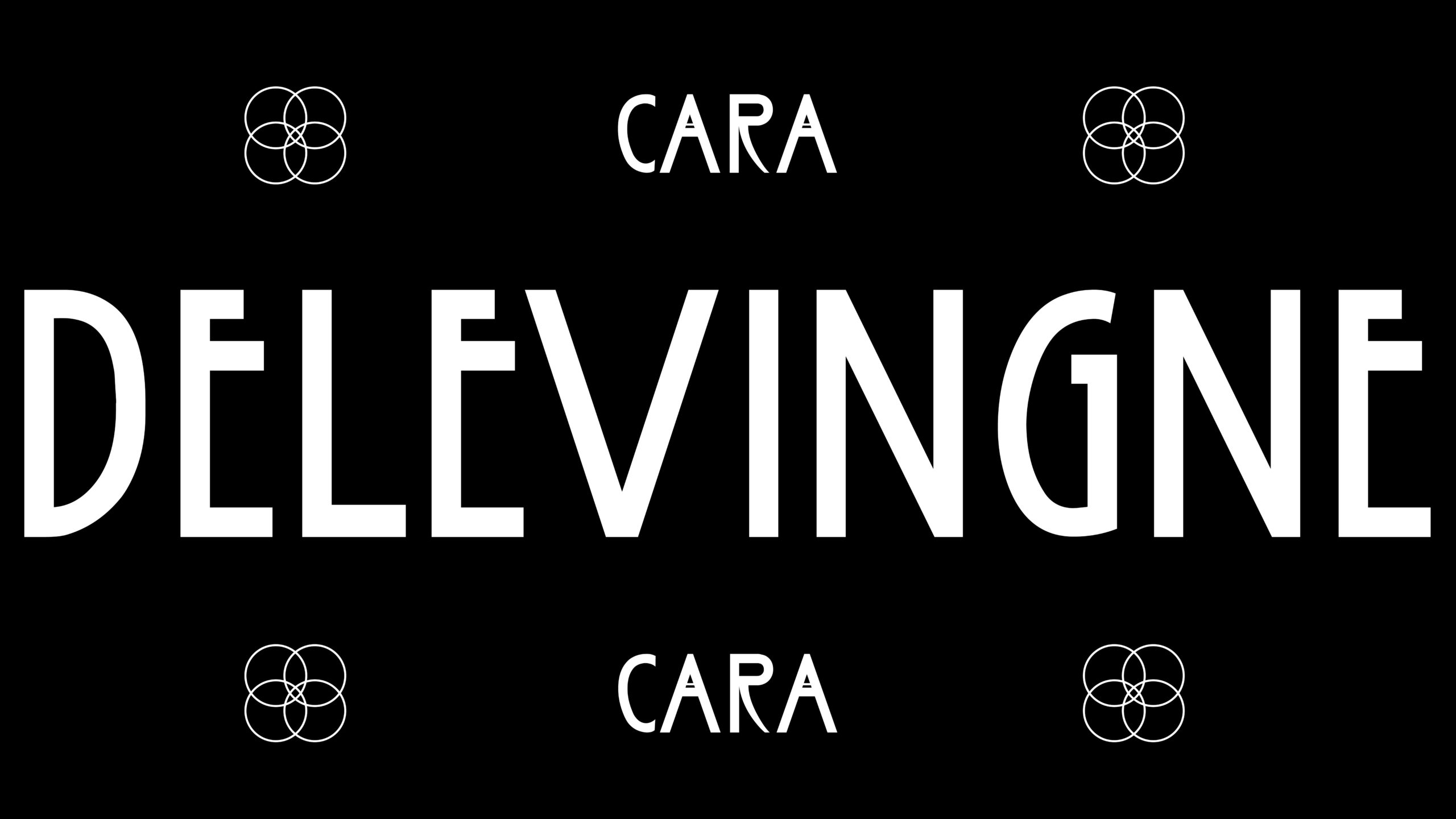
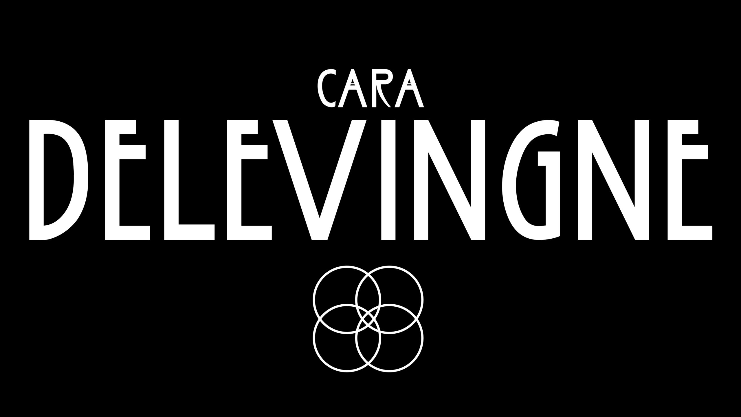
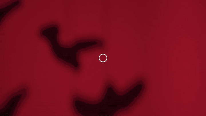
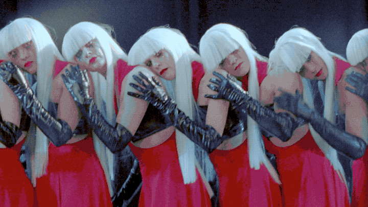
THE TWELFTH SEASON –– of American Horror Story will tread the "Delicate" balance between themes of the femme fatale and the evil spawn. With this season being the reintroduction of Kim Kardashian into the acting industry, it was imperative that the names of stars are the heroes of this season teaser.
My role in this campaign was to provide supporting edits and stringouts to the lead editor as she created the master sequences for this trailer. Then I provided explorations for the hero graphics, focusing on making the names as big and bold as the actresses they belonged to. You'll also see some motion tests and texture shots that were workshopped to capture the off beat and uncomfortably frightening nature of this upcoming season.
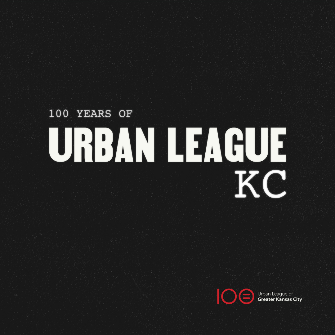
For over 100 years, The Urban League of Greater Kansas City has had one simple mission, "To enable African Americans and other disadvantaged persons to secure economic self-reliance, parity, power and civil rights." For the ULKC's 100th birthday, our team at Barkley gave this important organization a brand new identity to celebrate their history and where they were heading as an organization.
We accompanied this rebrand with a manifesto, illustrated by brave and bold kinetic typography. Drawing inspiration from typography and images of America's civil rights movements, as well as documentaries of adversity and perseverence such as "The Last Dance", we created a powerful piece of work, which declares that after 100 years, the Urban League of Greater Kansas City stands proud of their accomplishments, but the fight for equity is far from over.
LEARN MORE ABOUT ULKC
FOR OVER 100 YEARS –– The Urban League of Greater Kansas City has had one simple mission, "To enable African Americans and other disadvantaged persons to secure economic self-reliance, parity, power and civil rights." For the ULKC's 100th birthday, our team at Barkley gave this important organization a brand new identity to celebrate their history and where they were heading as an organization.
We accompanied this rebrand with a manifesto, illustrated by brave and bold kinetic typography. Drawing inspiration from typography and images of America's civil rights movements, as well as documentaries of adversity and perseverence such as "The Last Dance", we created a powerful piece of work, which declares that after 100 years, the Urban League of Greater Kansas City stands proud of their accomplishments, but the fight for equity is far from over.
LEARN MORE ABOUT ULKC
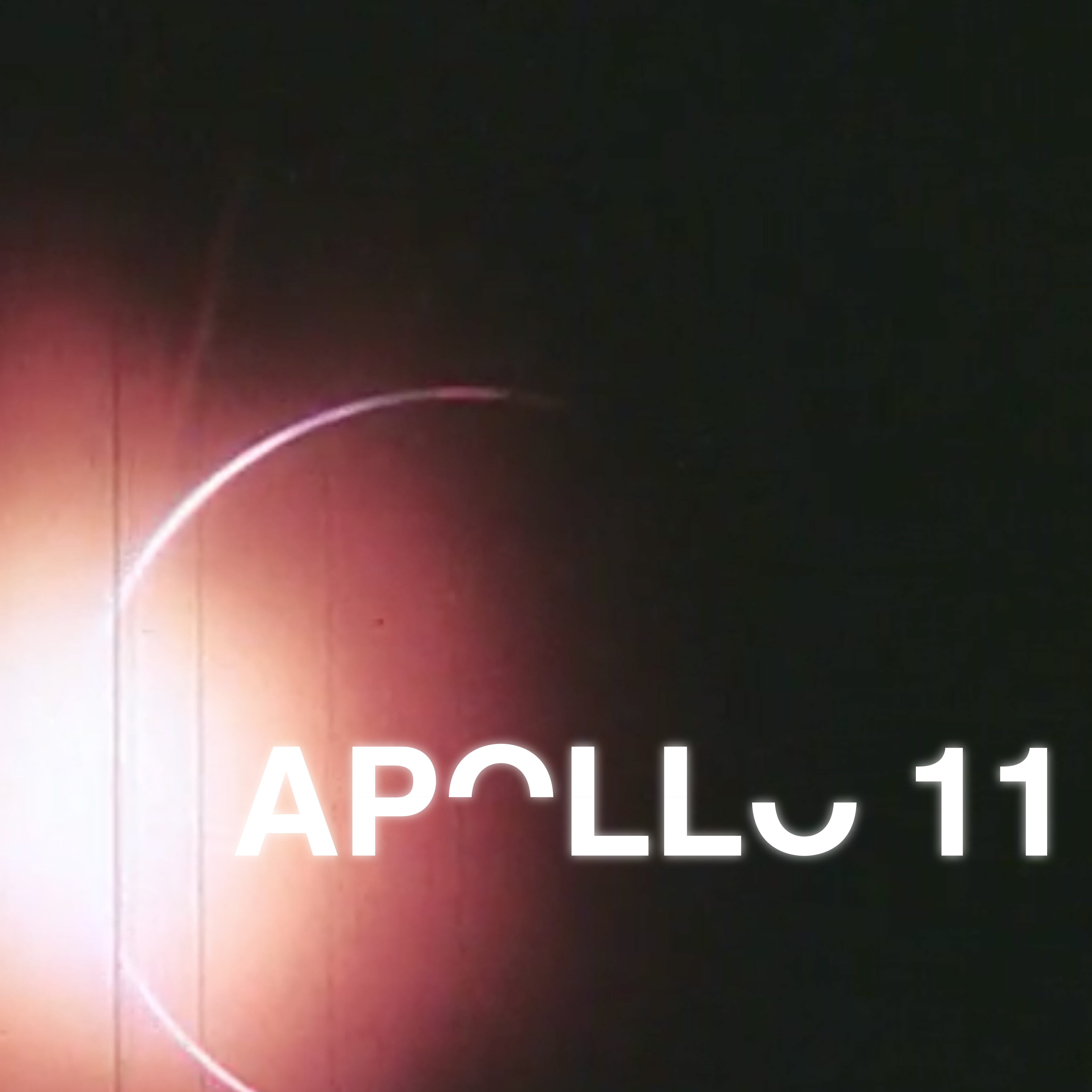
The primary objective of Apollo 11 was to complete a national goal set by President John F. Kennedy on May 25, 1961: perform a crewed lunar landing and return to Earth. On July 20, 1969, the presiding president, Richard M. Nixon, informed the people of the nation, in a haunting address, that our astronauts would not be returning home.
Or at least, that's what would have happened, had Neil Armstrong and Edwin (Buzz) Aldrin not made their return safely to Earth.
This piece is a kinetic type study, illustrating a speech that President Nixon had prepared for the worst case scenario of the Apollo 11 mission. I created a kinetic alphabet to bring barren and dramatic life to a font family that already symbolized bold, daring, and classic design.
RESEARCH & TYPOGRAPHY
RESEARCH & TYPOGRAPHY
RESEARCH & TYPOGRAPHY
RESEARCH & TYPOGRAPHY
RESEARCH & TYPOGRAPHY
GRAPHIC EXPLORATION
STORYBOARDING
STORYBOARDING
STORYBOARDING
STORYBOARDING
MOTION TESTING
STORYBOARDING
STORYBOARDING
STORYBOARDING
STORYBOARDING
CONTINUED ON PAGE...
BREEDERSN/A
THUNDERGONG 2019Event Production
URBAN LEAGUE OF KCIdentity
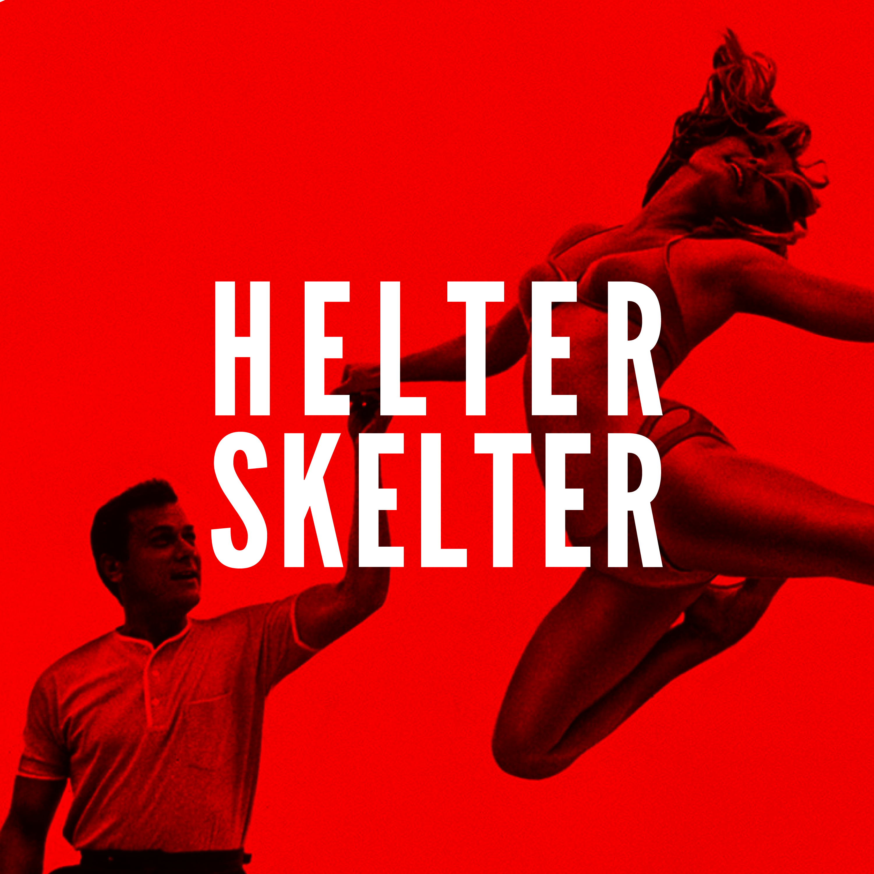
HELTER SKELTERPrint/Layout Design
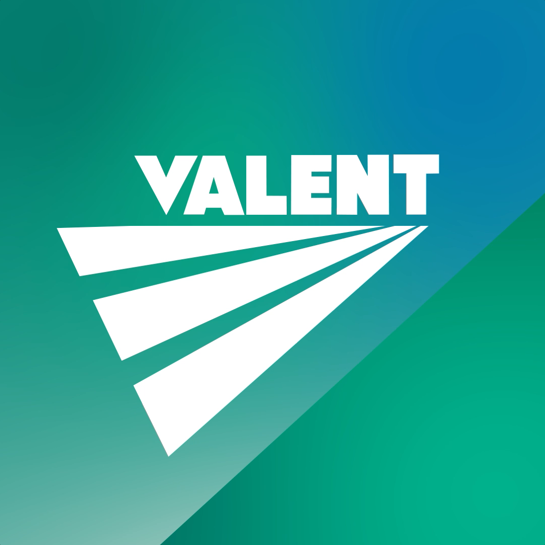
VALENT DESIGN SYSYEMIdentity
INDEPENDENCE DAYEvent Production

GAME THE VOTECampaign Video
BIG OH NOOOH Video
BCBSKS MARCH MADNESSBroadcast Media
APOLLO 11Kinetic Typography
DEAR EVAN HANSENAV/Social