
VOL. 26 MOTION DESIGN ED.
VOL. 26 MOTION DESIGNER EDITION
LIVING SINCE 1996 ★★★★★
LIVING SINCE 1996 ★★★★★
WHAT WAS I MADE FOR?
URBAN LEAGUE OF GREATER KC
URBAN LEAGUE OF GREATER KC
URBAN LEAGUE OF
GREATER KC
URBAN LEAGUE OF GREATER KC
FOR THE GIRLS
Motion Design By HALEY HENNIER
Design By HALEY HENNIER
Art Direction & Supervision By ALEX POPKIN / INGENUITY STUDIOS
Music & Lyrics By BILLIE EILISH
A CENTURY OF PROGRESS
Motion Design By HALEY HENNIER
Design By ZAC GREASON & ALYSON JACK
Written By JIM HOWARD
A CENTURY OF PROGRESS
Motion Design By HALEY HENNIER
Design By ZAC GREASON & ALYSON JACK
Written By JIM HOWARD
A CENTURY OF PROGRESS
Motion Design By HALEY HENNIER
Design By ZAC GREASON & ALYSON JACK
Written By JIM HOWARD
A CENTURY OF PROGRESS
Motion Design By HALEY HENNIER
Design By ZAC GREASON & ALYSON JACK
Written By JIM HOWARD
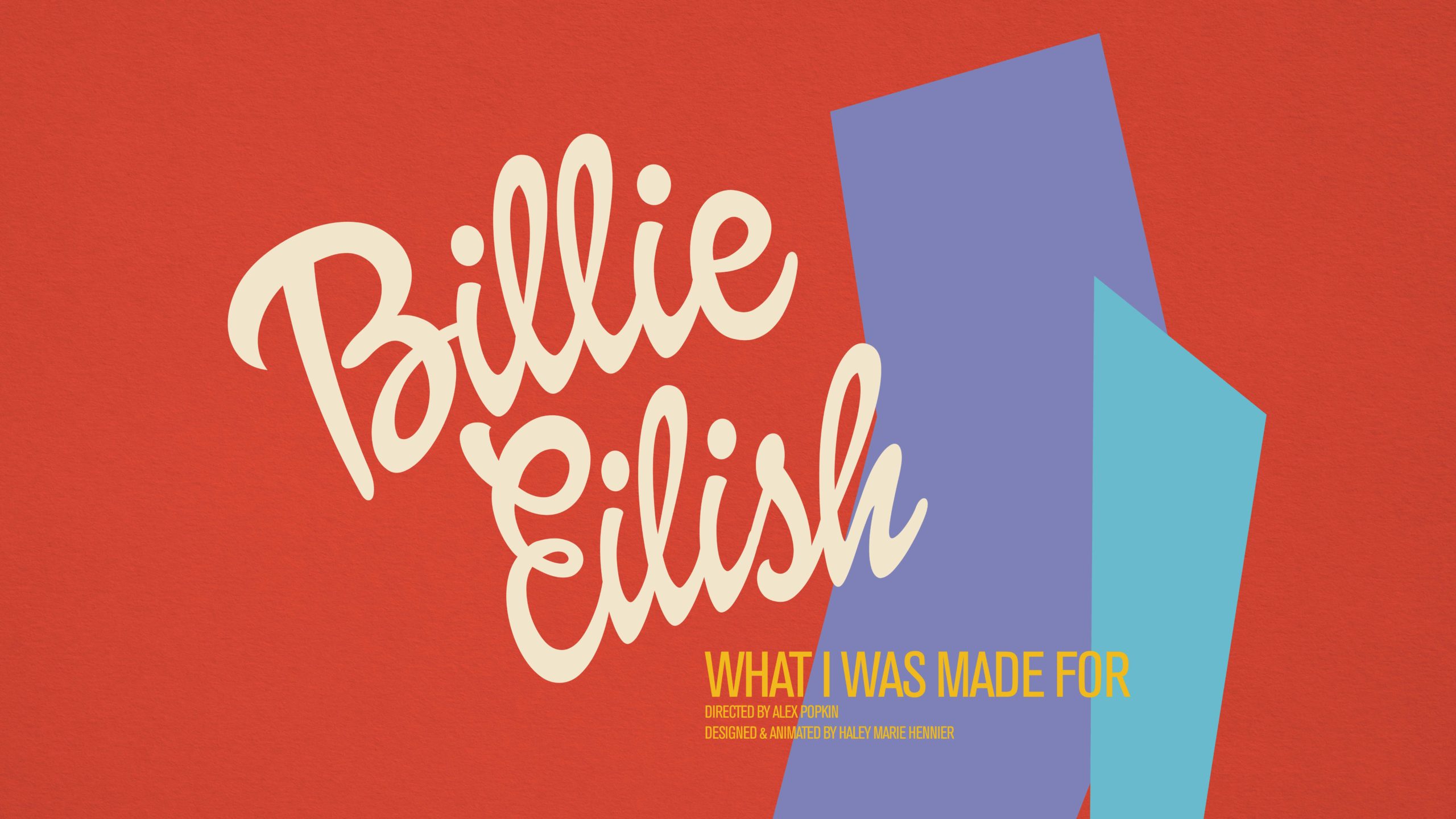
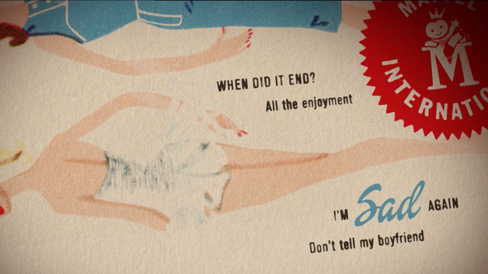
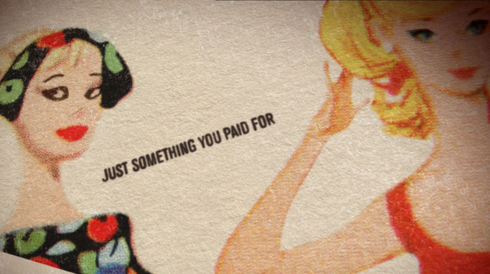
BARBENHEIMER WAS THE EVENT OF THE SUMMER –– Marking a massive return to theatres after the slump following Covid-19 quarantining in 2020. Barbie became a blockbuster and instant classic for women, children, and even men alike. Among other incredible artists, Billie Eilish was tapped to write the heartfelt and emotional cornerstone track of the film - What Was I Made For?
The song would go on to win a Golden Globe, a Grammy, and eventually the Academy Award for Best Original Song.
Parterning with the talented crew at Ingenuity Studios, I helped to design and animate the lyric video for What Was I Made For? Our work earned over 26 million views across Youtube and connected platforms.
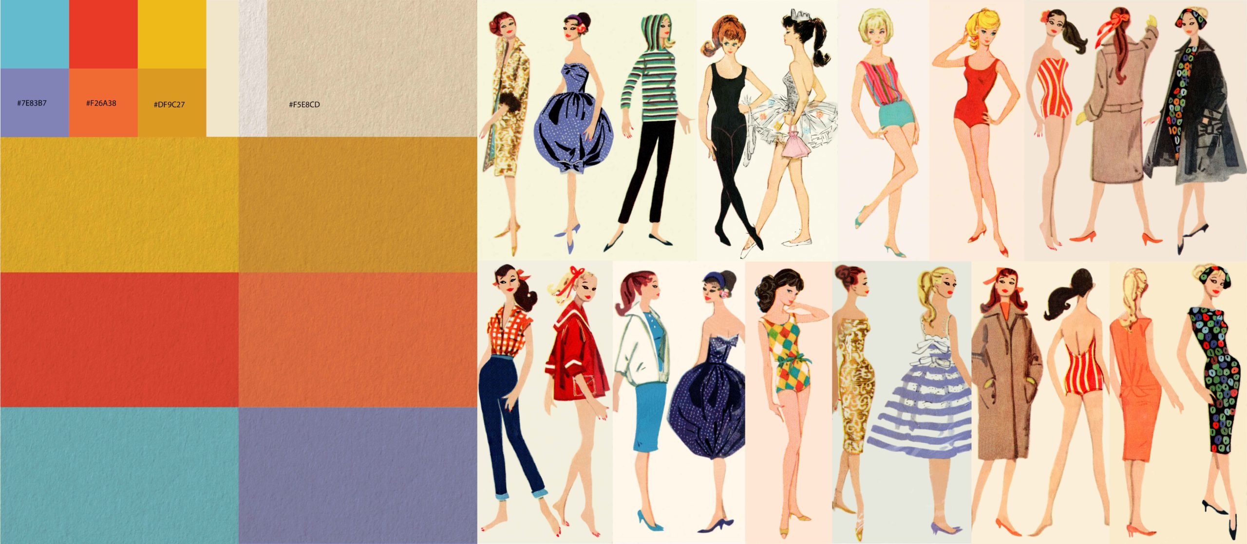
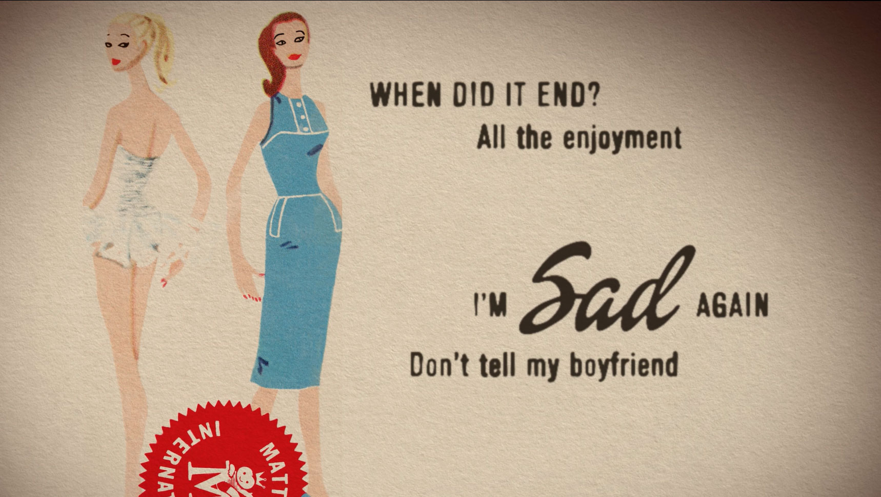
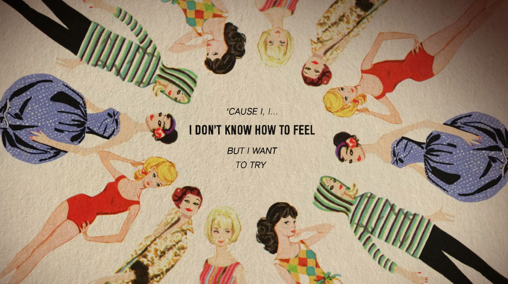
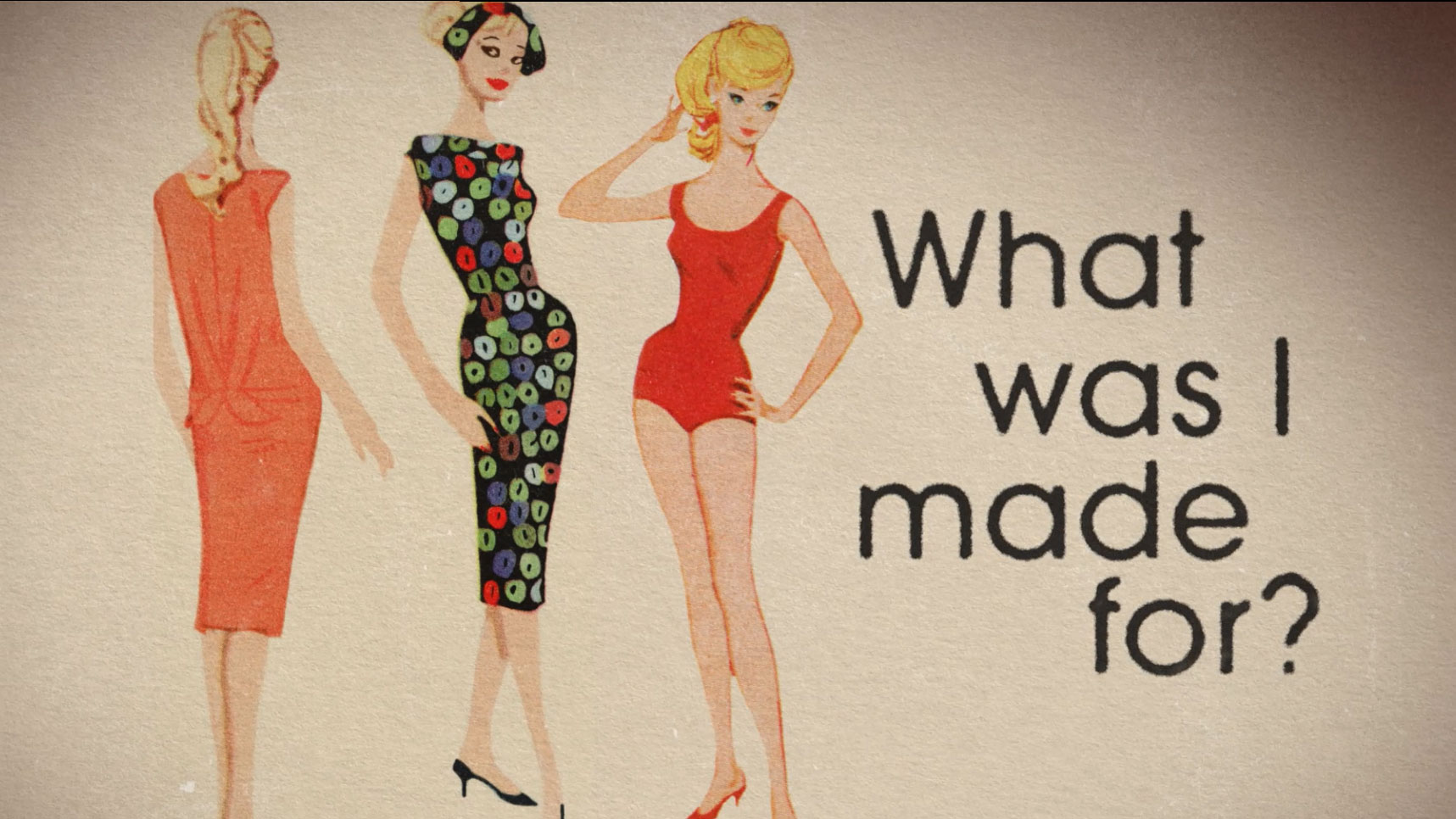
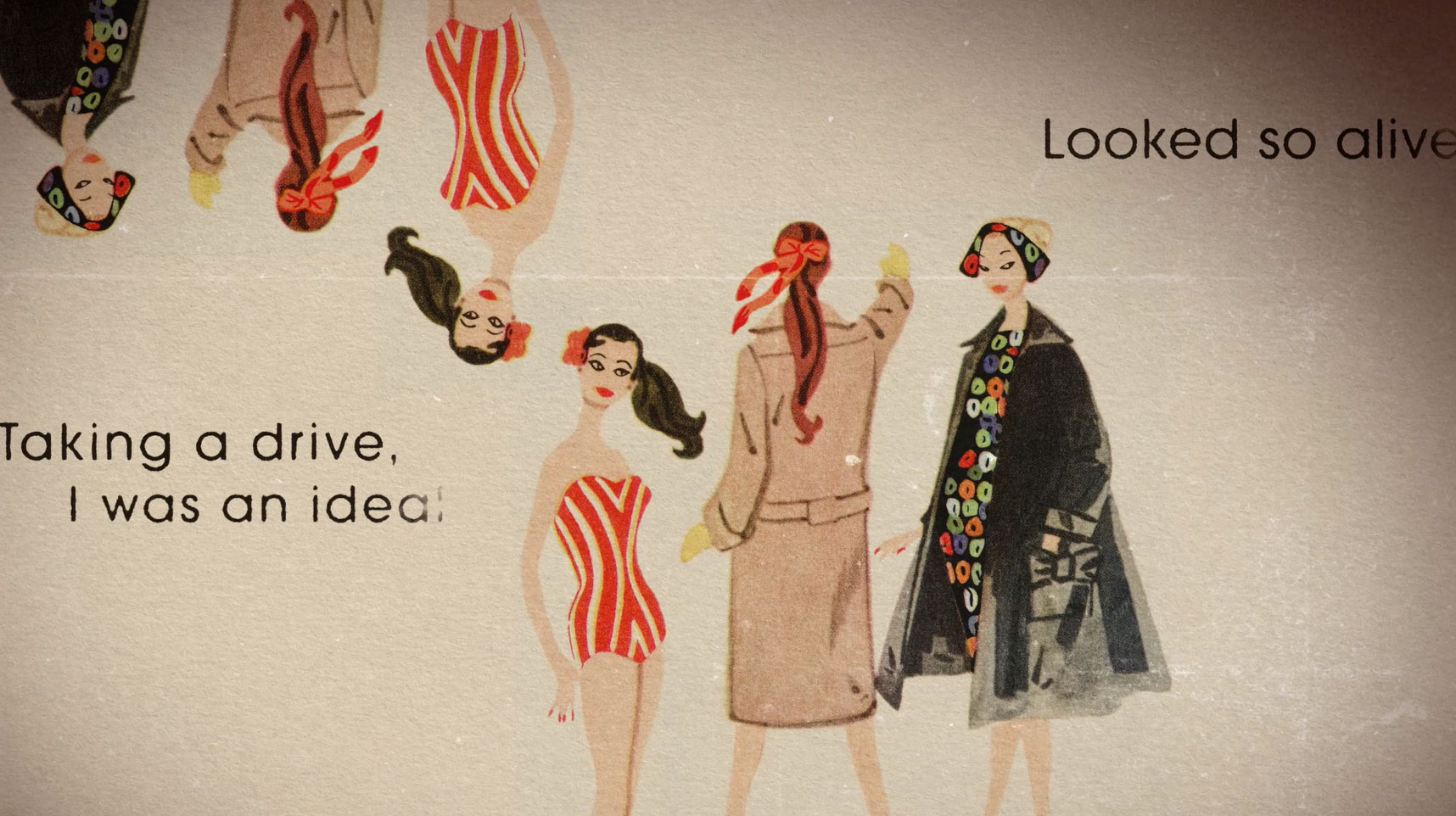
Mattel provided our team with high resolution scans of original box artwork from the Barbies of the 1960s. We used these pieces of collateral to create paper worlds for our Barbie's to exist, and to animate within. We explored dynamic ways to highlight the 2-dimensional assets while breathing life and movement into the static imagery, until the client ultimately decided to go in a simplified direction for the final piece.
For over 100 years, The Urban League of Greater Kansas City has had one simple mission, "To enable African Americans and other disadvantaged persons to secure economic self-reliance, parity, power and civil rights." For the ULKC's 100th birthday, our team at Barkley gave this important organization a brand new identity to celebrate their history and where they were heading as an organization.
We accompanied this rebrand with a manifesto, illustrated by brave and bold kinetic typography. Drawing inspiration from typography and images of America's civil rights movements, as well as documentaries of adversity and perseverence such as "The Last Dance", we created a powerful piece of work, which declares that after 100 years, the Urban League of Greater Kansas City stands proud of their accomplishments, but the fight for equity is far from over.
LEARN MORE ABOUT ULKC
FOR OVER 100 YEARS –– The Urban League of Greater Kansas City has had one simple mission, "To enable African Americans and other disadvantaged persons to secure economic self-reliance, parity, power and civil rights." For the ULKC's 100th birthday, our team at Barkley gave this important organization a brand new identity to celebrate their history and where they were heading as an organization.
We accompanied this rebrand with a manifesto, illustrated by brave and bold kinetic typography. Drawing inspiration from typography and images of America's civil rights movements, as well as documentaries of adversity and perseverence such as "The Last Dance", we created a powerful piece of work, which declares that after 100 years, the Urban League of Greater Kansas City stands proud of their accomplishments, but the fight for equity is far from over.
LEARN MORE ABOUT ULKC
The primary objective of Apollo 11 was to complete a national goal set by President John F. Kennedy on May 25, 1961: perform a crewed lunar landing and return to Earth. On July 20, 1969, the presiding president, Richard M. Nixon, informed the people of the nation, in a haunting address, that our astronauts would not be returning home.
Or at least, that's what would have happened, had Neil Armstrong and Edwin (Buzz) Aldrin not made their return safely to Earth.
This piece is a kinetic type study, illustrating a speech that President Nixon had prepared for the worst case scenario of the Apollo 11 mission. I created a kinetic alphabet to bring barren and dramatic life to a font family that already symbolized bold, daring, and classic design.
DESIGN & TYPOGRAPHY
RESEARCH & TYPOGRAPHY
RESEARCH & TYPOGRAPHY
RESEARCH & TYPOGRAPHY
RESEARCH & TYPOGRAPHY


STORYBOARDING
STORYBOARDING
STORYBOARDING
STORYBOARDING
STORYBOARDING
CONTINUED ON PAGE...
BREEDERSN/A
AMERICAN HORROR STORYPackage Design
THUNDERGONG 2019Event Production
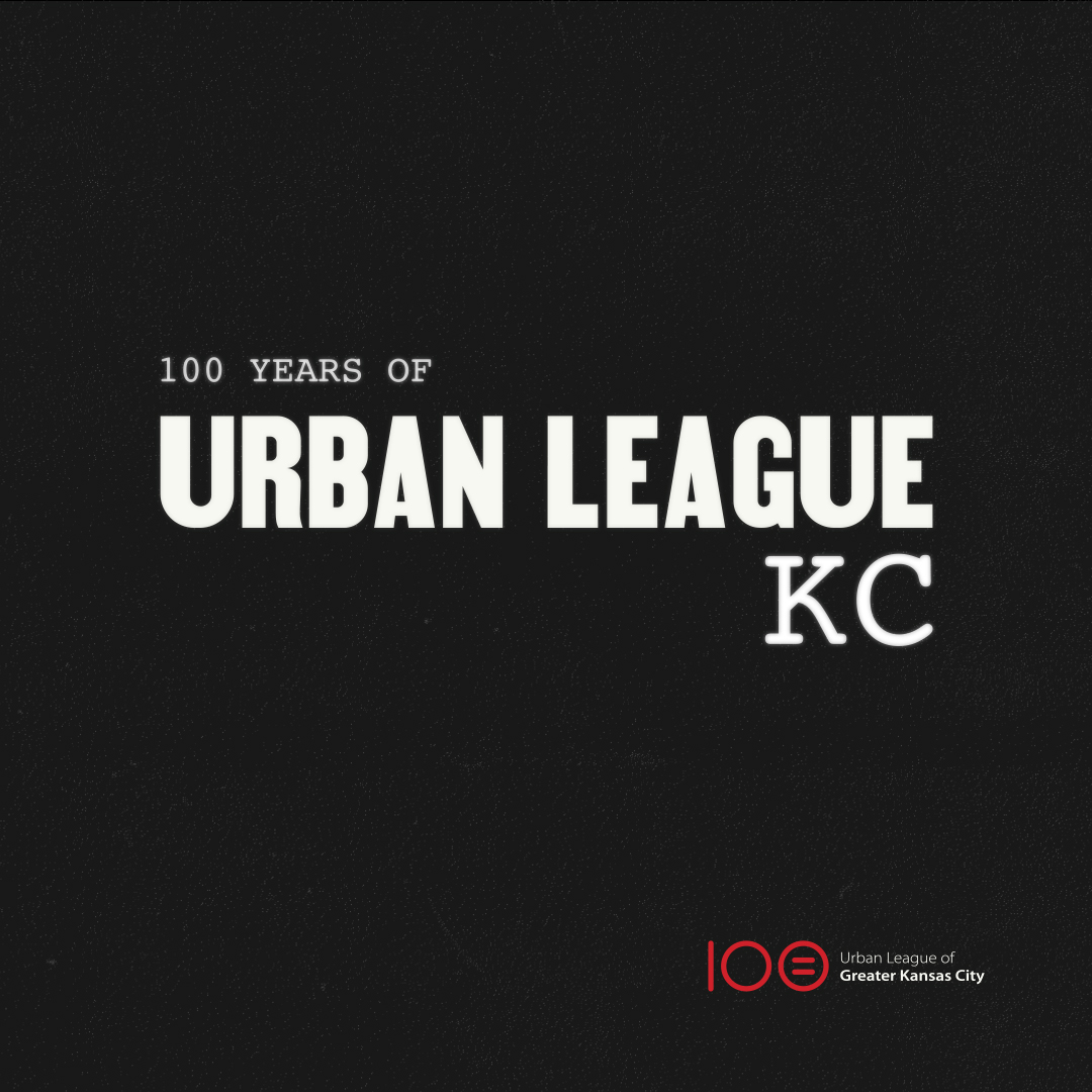
URBAN LEAGUE OF KCIdentity
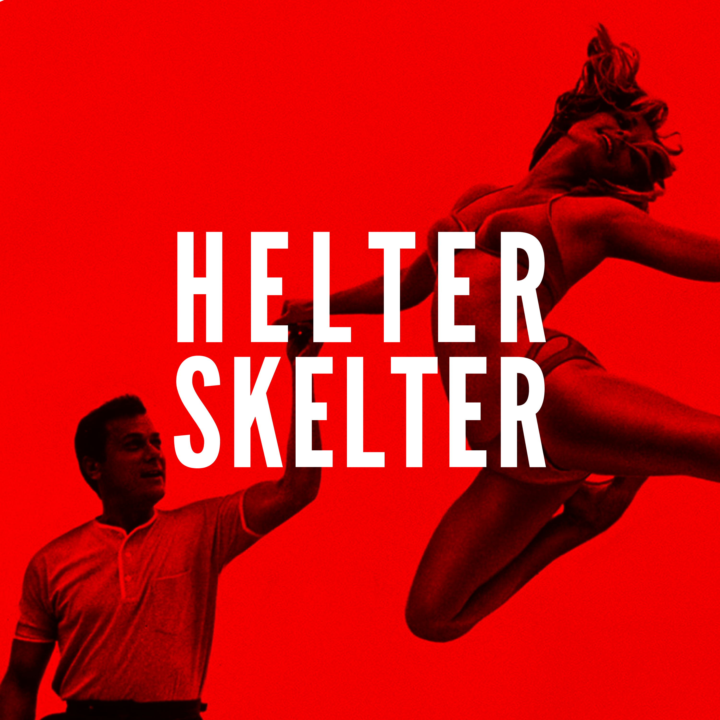
HELTER SKELTERPrint/Layout Design
VALENT DESIGN SYSYEMIdentity
INDEPENDENCE DAYEvent Production

GAME THE VOTECampaign Video
BIG OH NOOOH Video
BCBSKS MARCH MADNESSBroadcast Media
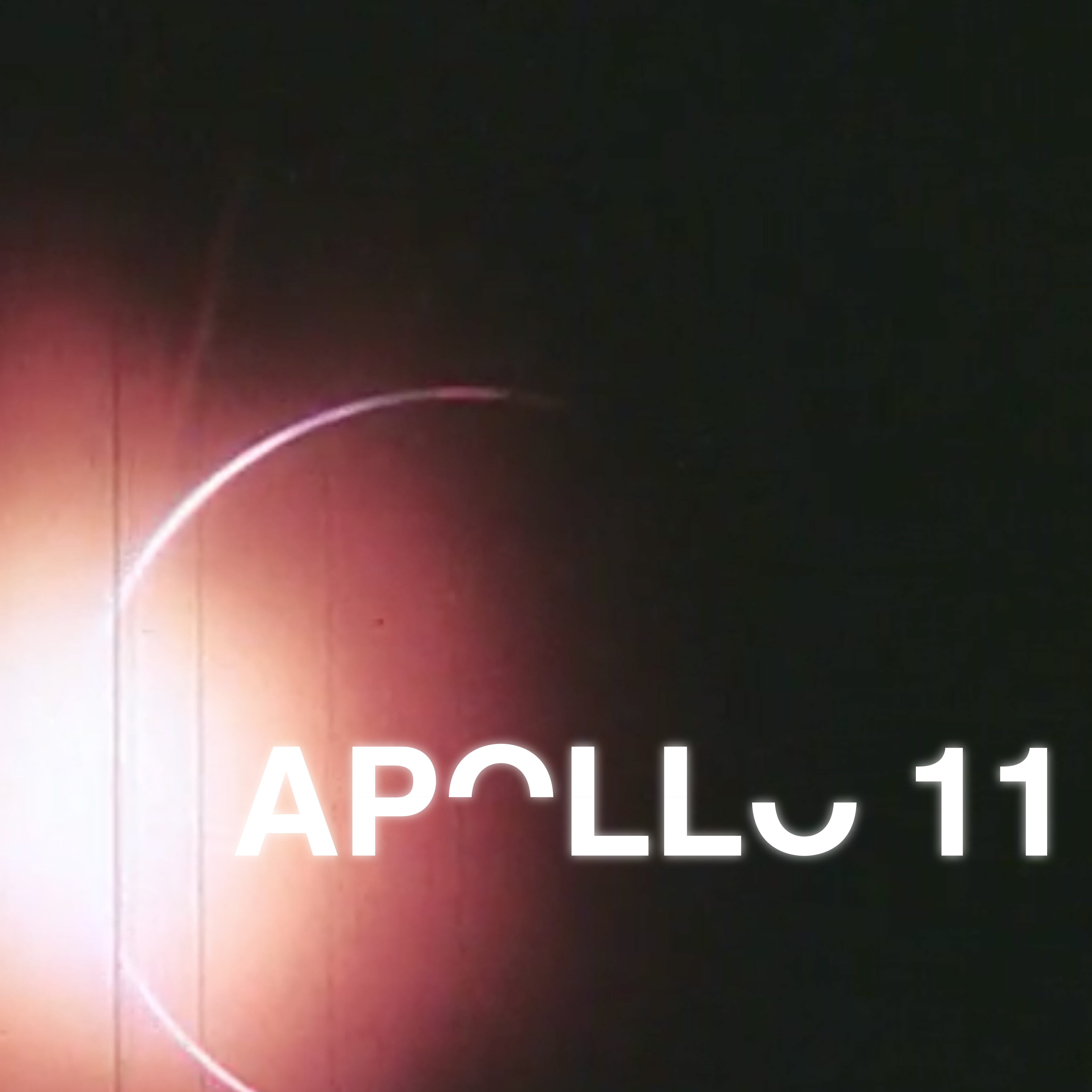
APOLLO 11Kinetic Typography
DEAR EVAN HANSENAV/Social